

Overcome limitations of Dynamics 365 dashboards with Power BI
Content
After starting their computers, dashboards are often the first thing project or division managers look at in the morning. Dashboards display the status quo of their corresponding business area, and only by knowing where your company stands can you do what is best for it.
That is why Microsoft embedded default dashboards in Dynamics 365 solutions such as Marketing, Sales and Project Operations. Depending on the application’s area of usage, the dashboards show different data. The dashboard of Dynamics 365 Sales, for example, shows current sales figures, the sales pipeline, opportunities and leads. While these overviews prove useful in everyday work, they reach their limits quickly.
When the functionalities of these default dashboards are not sufficient, Microsoft Power BI can help.
How exactly, we will clarify in this article.
What is Microsoft Power BI?
Power BI is the name for a series of applications, services and connectors that help organizations to visualize and analyze data from various sources. Microsoft’s business intelligence tool not only tells you the current state of your data, but can also make predictions and recognize trends – thanks to integrated artificial intelligence.
Power BI enables you to depict data from various sources in visuals and tables of your choosing. You can share your reports with anyone who has a Power BI license. These are available from $9.99 per user/month.
Tip: For a detailed presentation of the application, read our article Microsoft Power BI: Your gateway to a data-based company culture.
Four capabilities where Power BI surpasses Dynamics 365 dashboards
We have selected four areas where the functionalities of Dynamics 365 dashboards are very restricted in comparison to the many possibilities offered by Power BI.
1. Slice-and-dice certain aspects of a dashboard
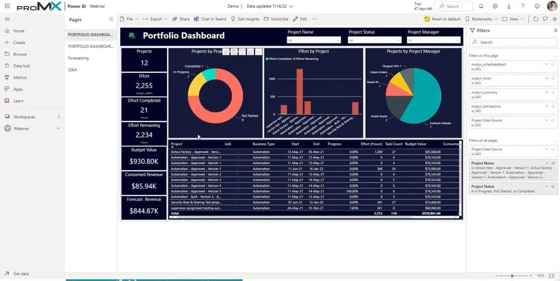
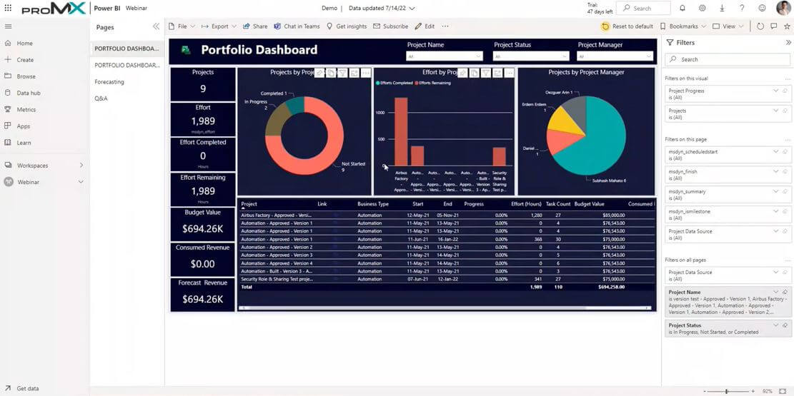
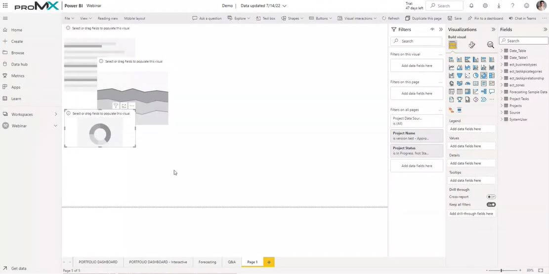
Often a dashboard shows several visuals that represent the same business area from different perspectives. To better understand the composition of a data set or to grasp the background, it might be useful to look at some numbers in more detail or even separately. To do so, you need to slice-and-dice the data so you can scrutinize certain aspects of the dashboard.
Possibilities with Dynamics 365 dashboards: It is possible to drill down into single numbers of a visual, but all other visuals remain the same.
Possibilities in Power BI: In Power BI, on the other hand, all visuals adapt accordingly when you choose an area you are interested in. Unless you specifically only want to filter one visual. You can do that, too.
Example (see screenshots): When you click on the “Not Started” projects in the visual on the left, the other two visuals only show information for that project area as well; in this case, the effort and the project managers for all projects which have not yet begun. And not just that: the table and the figures on the left also focus on that particular data.
2. Compare data
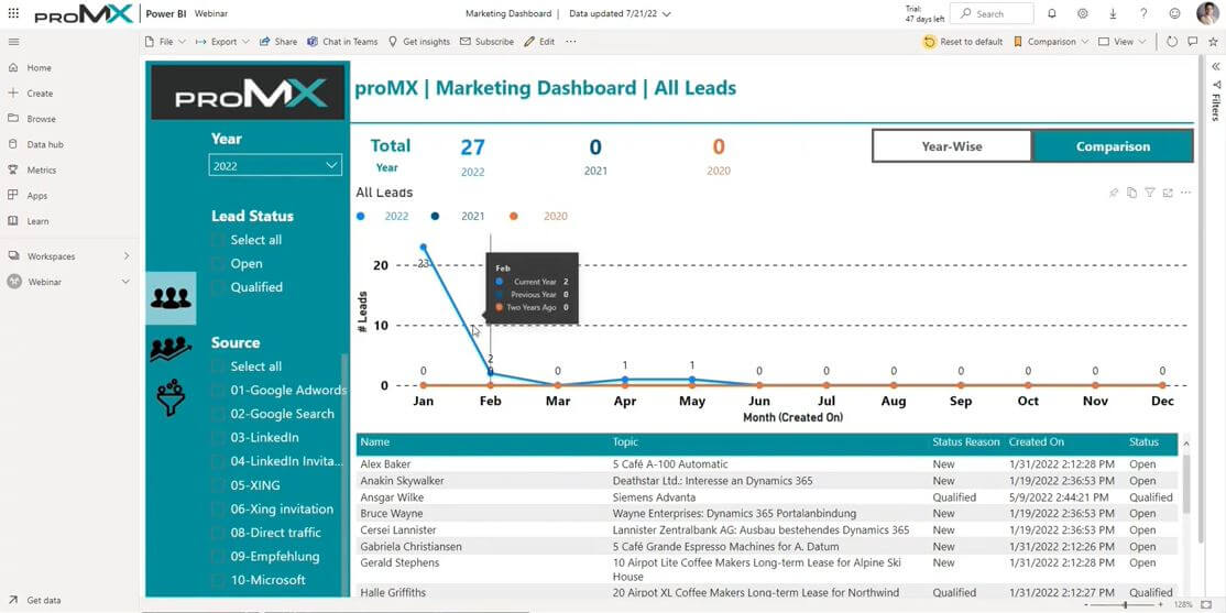
If you want to know how numbers have changed over a longer period (for example, to see if sales numbers have gone up) it is helpful to place data from several timeframes on top of each other.
Possibilities with Dynamics 365 dashboards: Overlaying data from a certain period, say, one year, with data from the following year is not possible. That means you can look at e.g., the sales numbers of your company in 2021 and then look at the same numbers from 2022, but only separated from each other. If you wanted to compare the data, you would have to do so manually.
Possibilities in Power BI: In this application, comparing data from a chosen time period is very simple. With one click you can overlay the data on a timeline. You immediately see how the numbers (in this case, the leads) have changed from one year to the next.
3. Design dashboards
The way data is displayed influences how well or fast we grasp it, and the manner of visualization helps to make correlations comprehensible. Besides, appealingly prepared reports bring more joy reading than standard reports.
Possibilities with Dynamics 365 dashboards: Dynamics 365 offers only very limited options to visualize data.
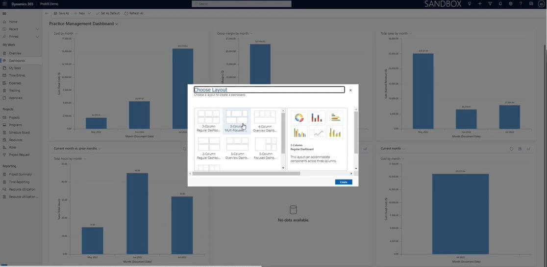
There are seven layouts to choose from and you can place a maximum of six visuals on one dashboard. These six comprise only standards like pie, bar or line diagrams.
Possibilities in Power BI: Microsoft’s business intelligence tool has a lot more to offer in this regard, allowing you to be creative in the design of your dashboards. You can use as many visuals as you like and place them anywhere on the dashboard, even on top of each other. The selection of visuals to choose from is huge, too.
4. Use different data sources
To present information in a way that lets you draw accurate conclusions, most importantly you need enough data. It can have various origins.
Possibilities with Dynamics 365 dashboards: Data for a visual can only stem from one data source (called “table” or formerly “entity” at Microsoft).
Possibilities in Power BI: Here you can draw your information from several different sources. They don’t necessarily have to be Microsoft-based; for example, you can also show data you gathered via applications from Adobe or Google on your dashboards.
Usage scenarios
Once more it depends on the requirements and plans of your business whether Dynamics 365 dashboards are sufficient for your purposes, or whether you should consider using Power BI.
Dynamics 365 dashboards for a quick overview
Despite the restrictions regarding their functions, dashboards embedded in Dynamics 365 can be useful. When you need to quickly gain an overview of what is going on, its simple dashboards are sufficient and provide you with the info you need fast. Furthermore, the limited functionality renders the usage rather simple.
Power BI for detailed business analyses
However, if it is your goal to analyze the current state of your business and make decisions based on data, Power BI is what you need.
This solution helps you to get detailed and individualized insights into different business areas while at the same time, allowing you to see the big picture.
Example: Thanks to Power BI, one of our customers with 20 manufacturing units worldwide recognized that three of them were continuously suffering losses. This realization caused the company to take measures to prevent these losses. When these measures showed no results, they decided to close the said units to avoid further damage to the company.
This example shows how being informed about what is going on at all your locations is crucial to company success.
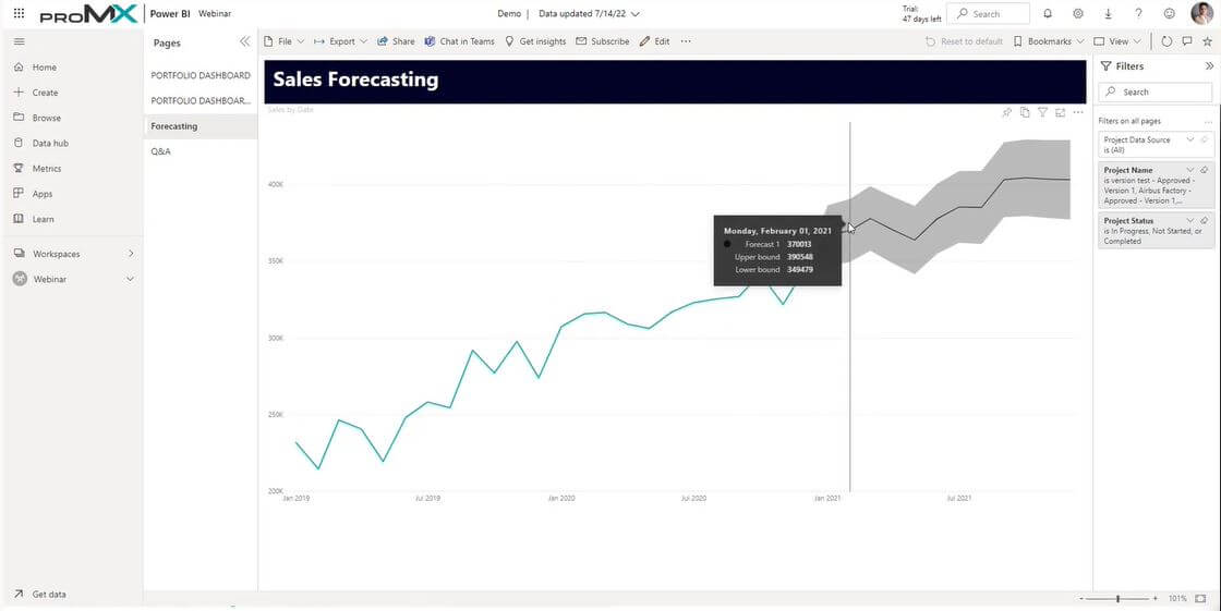
Additionally, Power BI creates predictions based on given data that forecast how certain numbers might develop in the future.
Video recommendation
To learn more about the topic dashboard usage we warmly recommend the following video:
In this webinar recording, Kuldeep Gupta, CEO proMX India, demonstrates the above-mentioned possibilities of Power BI. He also talks about more ways to use the business intelligence solution, for example in resource management.


RECENT POST
OUR EVENTS