
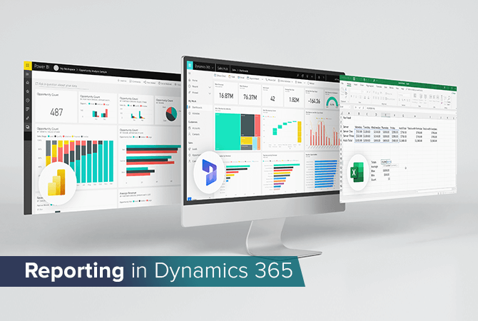
Reporting in Dynamics 365: Excel, dashboards or Power BI?
Each and every company has a slightly different understanding of the term “reporting” – in the end it all depends on your objectives, on the data required to measure them and how you would like to showcase that data, e. g. in tables or as charts. Such data could include:
- New leads per week
- Invoices due
- Upcoming tasks
- Top salespeople
- Data to measure against your KPIs
- Incomplete contacts in your database
Whether you work with one or more modules of Microsoft’s business suite Dynamics 365 – or you’re considering working with them in the near future – you can do your reporting in three different ways: with the well-known spreadsheet program Microsoft Excel, with native Dynamics 365 dashboards or with Power BI.
Dynamics 365 and Excel
Most of us have worked with Excel before and know what it’s about: the popular spreadsheet program lets you solve any problem at all – at first, that is. Recording contact data? No problem. Managing projects? Easy. Creating reports? Of course.
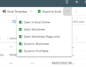
In Dynamics 365 too you can export your data simply and quickly to Excel with the help of an integration. Using Excel is particularly convenient because most companies are already familiar with it, making it a good starting point for reporting with Dynamics 365.
The export itself is simple, its preparation, too: Your Dynamics 365 admin in charge can assist you with collecting all your important and required data in one view. All there is left for you to do now is clicking “Export to Excel.” In Excel you can continue to work as you usually do to: summarize your data, create charts, etc.
If you have relied on Excel as your reporting tool so far, we recommend you look at Power BI as an alternative solution.
Dynamics 365 dashboards
Dynamics 365’s native dashboards are perfect for your everyday work. You can mix and match all the information you need in just a few clicks without having to set up an integration first. Marketing, sales or project managers, for example, can receive immediate updates about the status quo of their tasks.
Data sources for native Dynamics 365 dashboards are limited to the Dynamics 365 module you work in; comparisons of data from another module or from external systems are only available with Power BI.
If you would like to visualize your sales funnel, for instance, or new leads sorted by source, you can simply use all standard visualizations that would be available to you in Excel too, i. e. funnel charts, bar charts or pie charts, etc. You are free to add a notification bar to your dashboard or build an entirely new dashboard made up of different columns. With the help of columns, you can neatly display open tasks, upcoming calls, open leads or open opportunities.
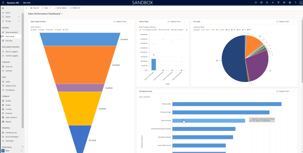
Sounds simple enough? It is simple enough. Much of the data in Dynamics 365 can be visualized with just a click and displayed in a way that makes it easier to grasp. As soon as you try to compare different data, however, native dashboards reach their limits.
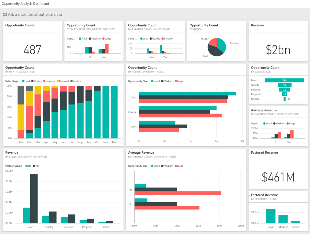
Dynamics 365 and Power BI
The more data your report requires, the more sources it potentially comes from – and the more complicated it would become to display in a simple table. That eliminates both Excel and native Dynamics 365 dashboards as an effective means for reporting. In this situation Power BI truly gets to shine.
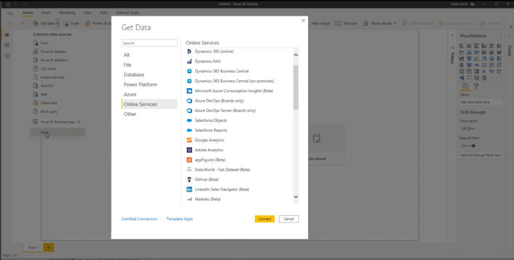
Power BI has become a well-known tool among more and more companies: the app combines business intelligence and data visualization, and lets its users create custom dashboards from a large variety of data sources. Power BI is also part of the Microsoft Power Platform, which is composed of of four low-code apps in total. These are perfect for people with little or no programming skills who would still like to develop their own business apps.
Power BI as a reporting tool for Dynamics 365 particularly stands out in the four following areas:
- You would like to dive deeper into certain parameters.
- You would like to compare data.
- You would like to present your report in a visually appealing way.
- You would like to use different data sources.
Head over to this article for a detailed comparison of Dynamics 365 dashboards vs. Power BI or to watch the video included in the text.
All in all, Power BI isn’t just a tool for data analysts and other experts to use. Its ability to visualize complex information also makes it perfect for sales managers who would like to follow the latest updates to their leads and sales pipeline from anywhere. Meanwhile, HR can compare the monthly sick leaves within the company, and accounting never loses track of open or overdue invoices.
Now that you have a solid overview of the different reporting options available in Dynamics 365, you might be ready to create your own custom report. If so, let’s talk! Our experts are happy to answer your questions in person.


RECENT POST
OUR EVENTS