

Build your first Power BI dashboard in 5 steps
Content
“Big data,” “data science,” “data-driven company”: There is no shortage of data-related buzzwords. However, the message remains the same: Companies must work with data to make informed decisions. Fortunately, nowadays this no longer includes scrolling through boring and messy spreadsheets. Instead, you can utilize a Power BI dashboard, with Power BI being the most renowned business intelligence tool available, and easily create and personalize dashboards for your reporting purposes.
In our article, you will learn how to create a user-friendly data overview that can be easily navigated by everyone within the company.
What is a Power BI dashboard?
A Power BI dashboard provides you with a comprehensive overview of your data. In other words, it condenses the most significant data insights into various visuals on a single page. The dashboard incorporates data from your reports, allowing you to visualize and pin as many insights as necessary.

This offers numerous benefits:
- Info at a glance: Users can easily browse through a summary of their dashboard data and quickly analyze it.
- Visuals can be created from various data sources and reports
- Customization options are available to personalize your dashboard and include all the necessary elements.
- Embedding your dashboard in other programs, such as your preferred Dynamics 365 module, is possible.
- Sharing your dashboards with colleagues within your company is effortless.
A business that does not generate data? Unheard of. Businesses that have data (but nobody to prepare it) and make decisions based more on intuition than facts? You can guess the answer. If you haven’t heard about Power BI yet, familiarize yourself in our article and learn how to establish a data-based company culture!
Tutorial: building a Power BI dashboard
Power BI dashboards are a feature available in Power BI Service, where you can create reports using both Power BI Service and Power BI Desktop. With the appropriate license, nothing stands in your way of creating your first dashboard right away. Simply visit https://app.powerbi.com to get started!
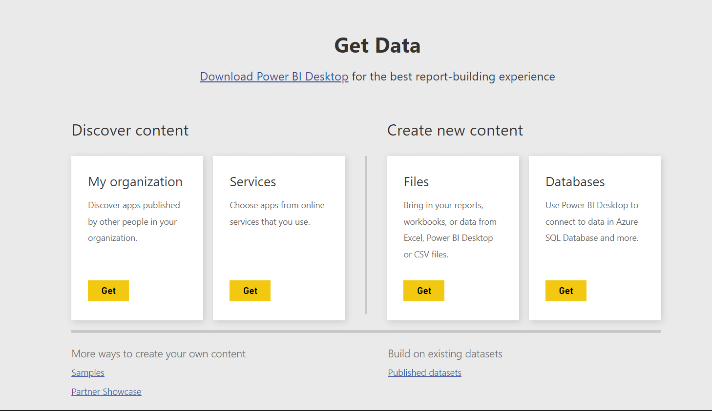
Step 1: Import data
The first step in creating a Power BI dashboard is to import the data that will serve as the basis for your report. You have a wide range of options, including Excel spreadsheets, databases, data from the internet, and various other cloud services.
You can upload your chosen data source to the Power BI Service Portal. Our tip: Create a simple Excel file with some data to try it out!
Step 2: Open report from imported data
After uploading your data source, you will see two files: one is your data set (e.g. an Excel spreadsheet) and the other is the dashboard. Click on the former and select your data source in the blank interface that opens.
If you are already familiar with Power BI Desktop, the new editing canvas will look familiar to you!
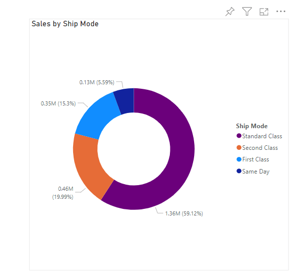
Step 3: Create a tile
Power BI Service offers a range of options to make your dashboard visually appealing and easy to understand, such as charts, images, or shapes.
Once you have chosen a data source for your dashboard, the next step is to determine the insights you want to present. Having a clear plan will make it easier to design and lay out your dashboard later on.
Navigate to the menu bar and add a chart, for example.

Tip: If you haven’t saved your report yet, now is a good time to do so to avoid accidentally losing your progress!
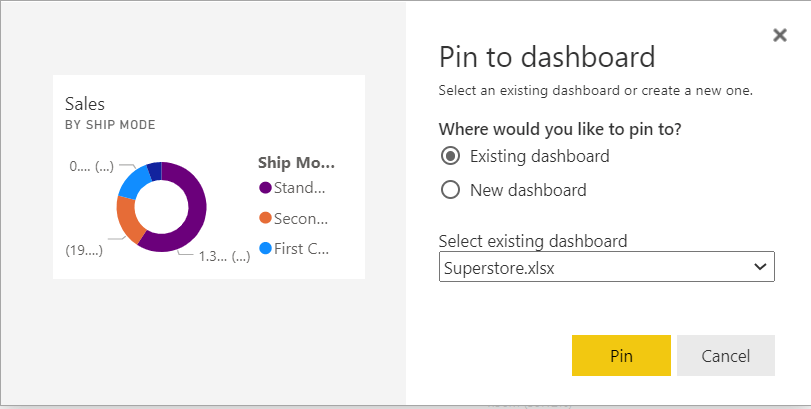
Step 4: Pin a tile
You can now pin the tile you just created to your dashboard. Locate the desired tile and click on the pin icon. You can choose to add the tile to the dashboard that was automatically created by uploading your data source at the beginning or create a new dashboard.
Power BI Service will take you to your new dashboard where you will see the tile you created for your report.
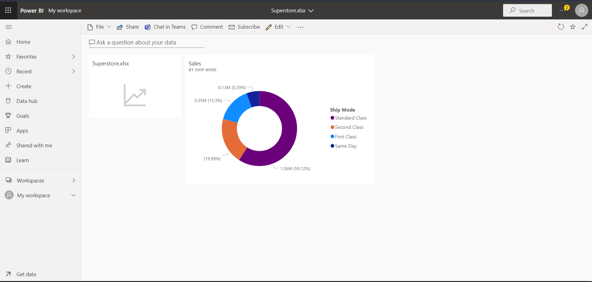
Step 5: Organize and update tiles
Once you have created more elements in your report and added them to your dashboard, you can focus on organizing the layout:
- Position your tiles using drag and drop (navigate to the desired tile with your mouse, hold down the left mouse button, and drag the tile to the desired location).
- Adjust the size of your tiles using the small arrow in the bottom right corner.
- Modify other settings of your tiles by clicking on the three-dot menu in the upper right corner.
What’s the difference between a Power BI dashboard and a report?
The dashboard serves as a central hub where you can obtain an overview of the big picture and customize it. It brings together data from multiple reports and sources, presenting it through various charts. This visual representation facilitates faster decision-making for users.
In contrast, a report offers detailed information about specific data sets. It typically consists of multiple pages that include text, images, charts, and tables, rather than providing a centralized overview.
In a nutshell, a dashboard allows you to track key metrics and KPIs at a glance, whereas a report enables you to delve into individual data sets with greater depth.
| Dashboard | Report | |
| Data sources | Based on multiple connected data sources | Created from a single data source that isn’t connected to other sources |
| No. of pages | A single page with a summary of the most important report insights | Generally includes multiple pages |
| Visualizations | Focused on attractive visuals, graphs, charts, etc. | Not concentrated so much on visualization |
| Slicers and filters | There are no filters or slicers for dashboards | Filters and slicers are available for reports |
| Type of information | Summarizes insights that are only important to end users | Detailed break downs of each report category on multiple pages |
| Data set view | The reader only gets the single-page information without seeing the source data | All raw data can be viewed in detail (e. g. tables, fields) |
Conclusion and resources
Now that you have a grasp of the basics of creating a Power BI dashboard and an understanding of its key features, you can enhance your day-to-day work regardless of the Dynamics 365 module you use. With a Power BI dashboard, you’ll have a clear overview of all the relevant developments at a glance, making your work much easier.
If you haven’t started using Power BI yet or if you’re unsure whether you’ve fully explored all the possibilities, Microsoft provides valuable learning resources to support you:
proMX has successfully completed numerous projects where Power BI reports and dashboards played a crucial role, including a collaboration with Deutsche Bahn. In addition to comprehensive project management, the company required full transparency in controlling key performance indicators, as well as data-driven reports and analyses for managing their 11-billion-euro climate protection package.
We would be happy to have a personal, no-obligation meeting to learn more about you and your company!